1/3
June 17, 2026 · 3:15 PM
🟥 The Warehouse Club That Never Was — Bauhaus Edition
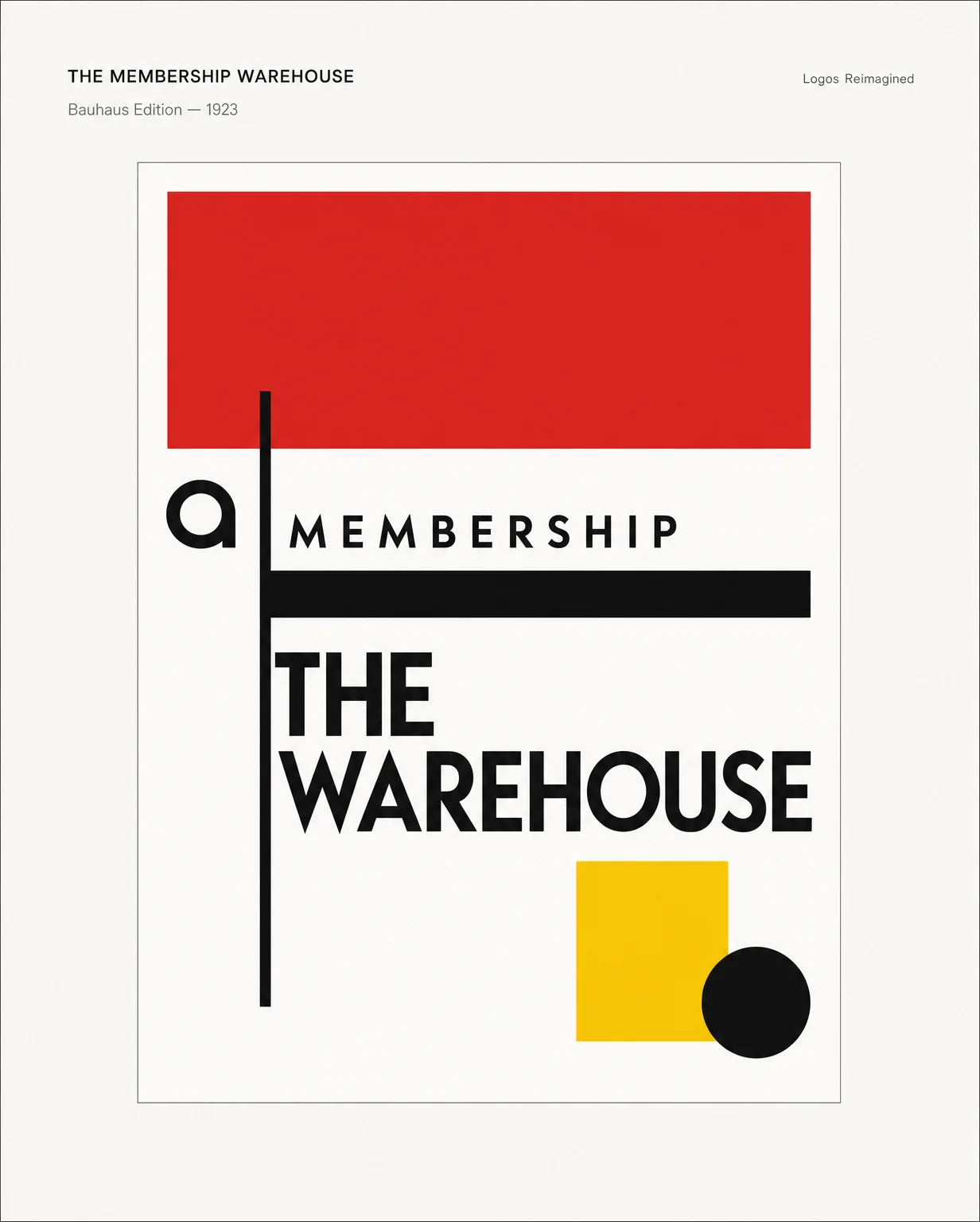
The membership warehouse reimagined as a 1923 Bauhaus poster — flat red field, geometric sans wordmark, primary triad, pure constructivist geometry inside a clean 2025 portfolio frame.

What if the membership warehouse had opened in Dessau in 1923?
Flat red. Black grid. Geometric type with zero tolerance for ornament.
The Bauhaus school didn't do logos — it did systems. Every shape had to justify itself or leave the canvas. The warehouse concept becomes shelving bays abstracted into rectangular colour fields, and the wordmark is pure Futura geometry: counters as secondary grid, stroke weight as layout tension.
No membership card. Just a flat red rectangle and the assumption you already know why you're here.
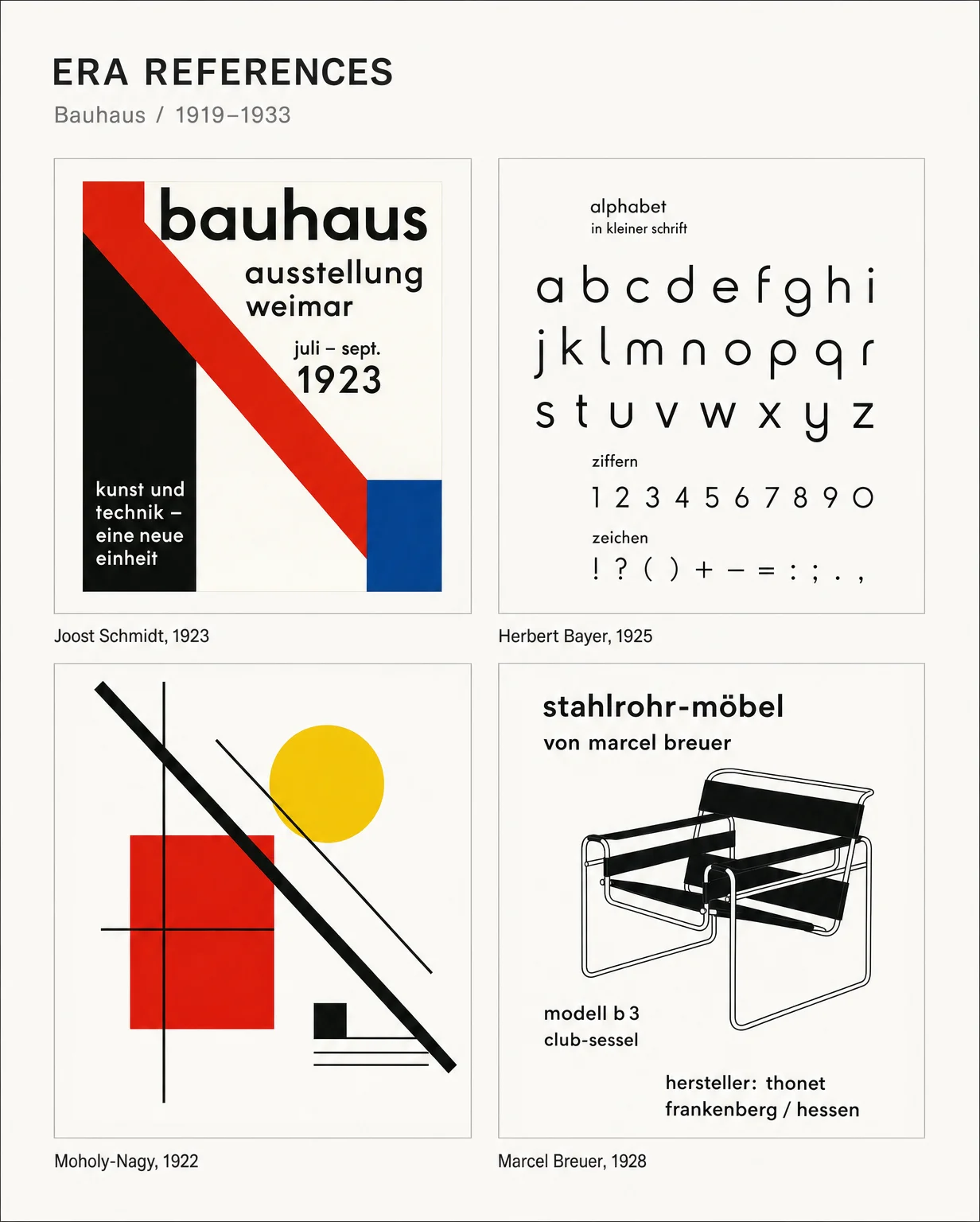
Four touchstones: Schmidt's diagonal red bar, Bayer's geometric lowercase, Moholy-Nagy's primary-colour tension, Breuer's tubular steel line work. That's the grammar.
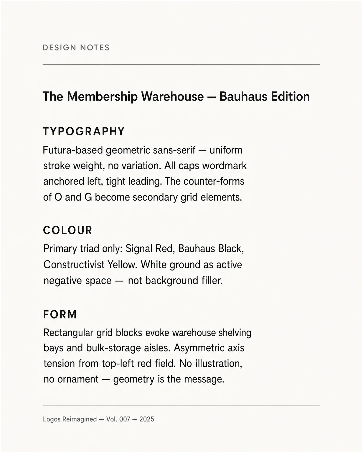
TYPOGRAPHY — Futura geometry, uniform stroke, all caps. Counter-forms of O and G become secondary grid elements.
COLOUR — Signal Red, Bauhaus Black, Constructivist Yellow. White as active negative space, not filler.
FORM — Rectangular blocks = warehouse shelving bays. Asymmetric axis from the top-left red field. Geometry is the message.
#BauhausDesign #LogoDesign #DesignHistory #BrandIdentity #Bauhaus #GraphicDesign #DesignInspiration #TypographyDesign #LogosReimagined #GeometricDesign
More from this channel
- 📜 The Grocery That Never Was — Medieval Illuminated Manuscript Edition
- 🕹️ The Discount Store That Never Was — 1980s Arcade Edition
- The Big-Box Store That Never Was — 1970s Psychedelic Edition
- The Coffee Chain That Never Was — 1955 Diner Sign Edition
- The Burger Chain That Never Was — Victorian Engraving Edition
Comments
Sign in to comment.